A Bold Spirit, Wisely Done.
J.P. WISER's
It was time for J.P. Wiser’s to claim its hard-earned, well-deserved place as a world-class icon. Despite a long legacy, the brand’s visual identity had become inconsistent, leaving drinkers reaching for something else. Tasked with empowering the brand with a new identity that celebrated its illustrious past while boldly looking to the future. This wasn’t about reinventing J.P. Wiser’s; it was about restoring belief in the brand as a true, dependable whisky that hard-working Canadians could feel genuinely proud of. "A bold spirit. Wisely Done."
A BOLD VISION:
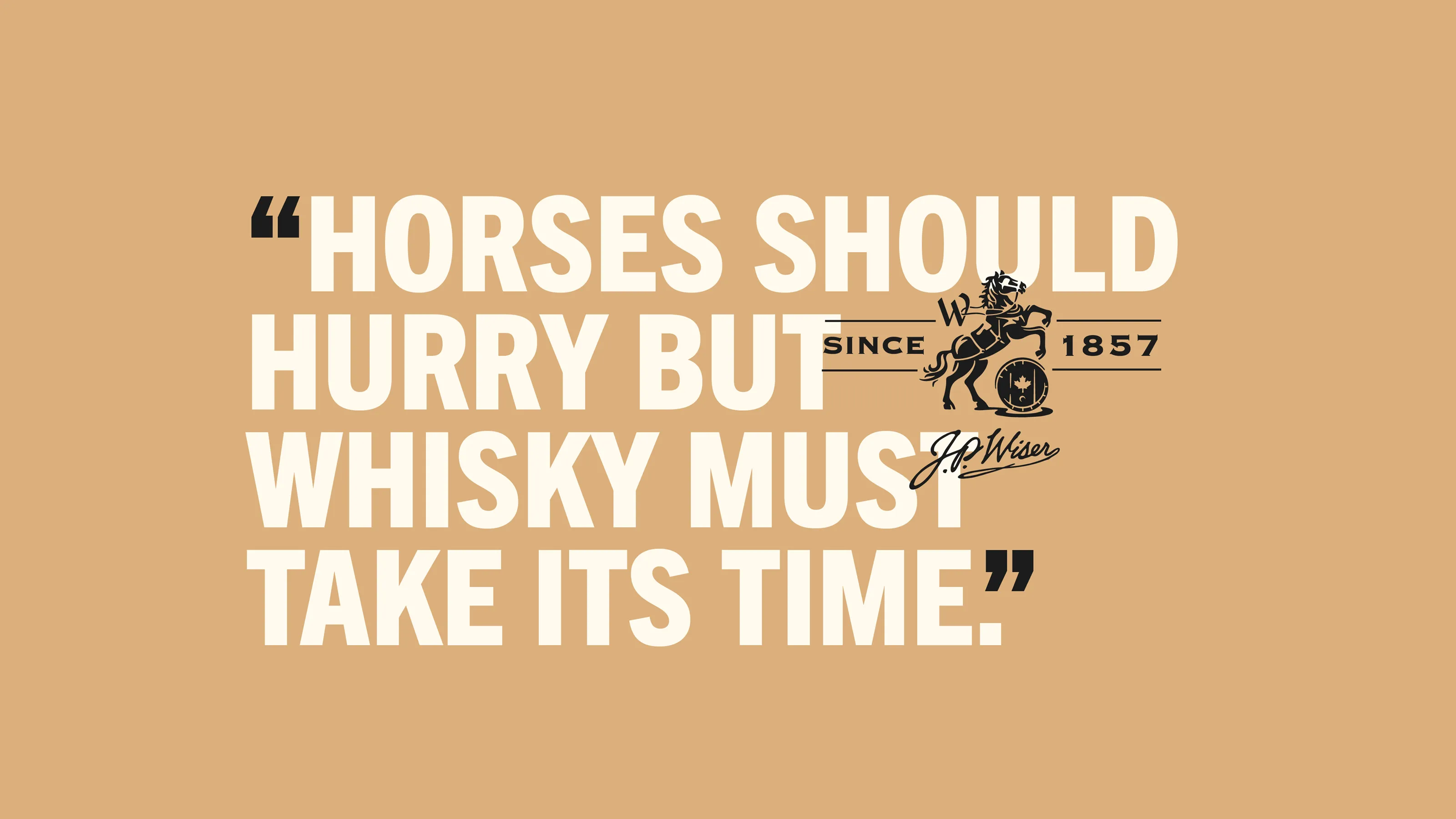
It all started with a ranch. Spent grain fed horses. An idea cooked up only by a true entrepreneur. A distillery became duel use. Revisiting the brand’s story, history and legacy, letting this compelling narrative lead the way when creating the brands new iconic elements and reinterpreting them for a twenty-first-century audience. By making its iconography distinctive, ownable, and heroic, J.P. Wiser’s evolved into a whisky that felt proud, confident, and unmistakably Canadian, while telling a compelling story.

UNEARTHING the Past
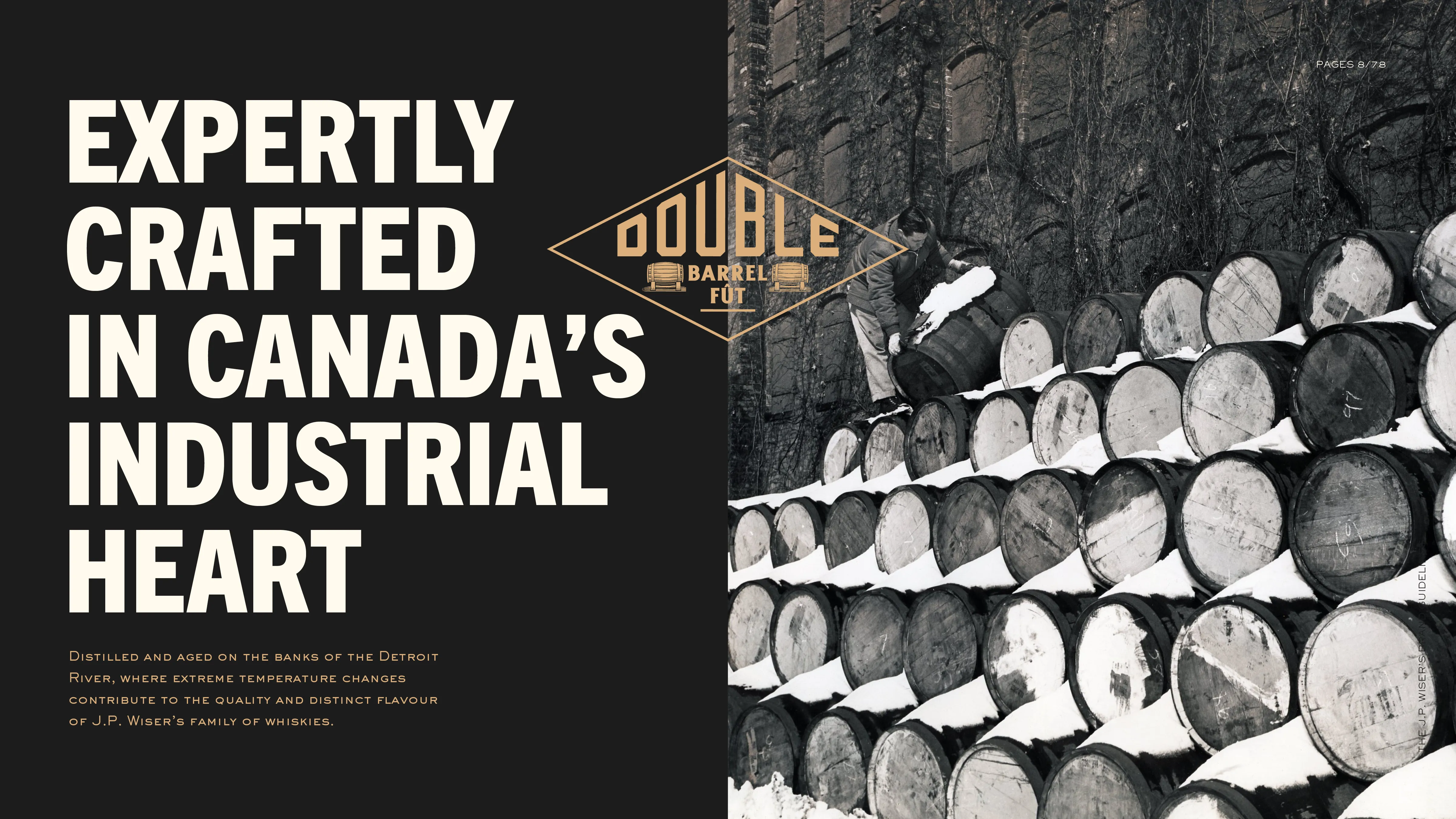
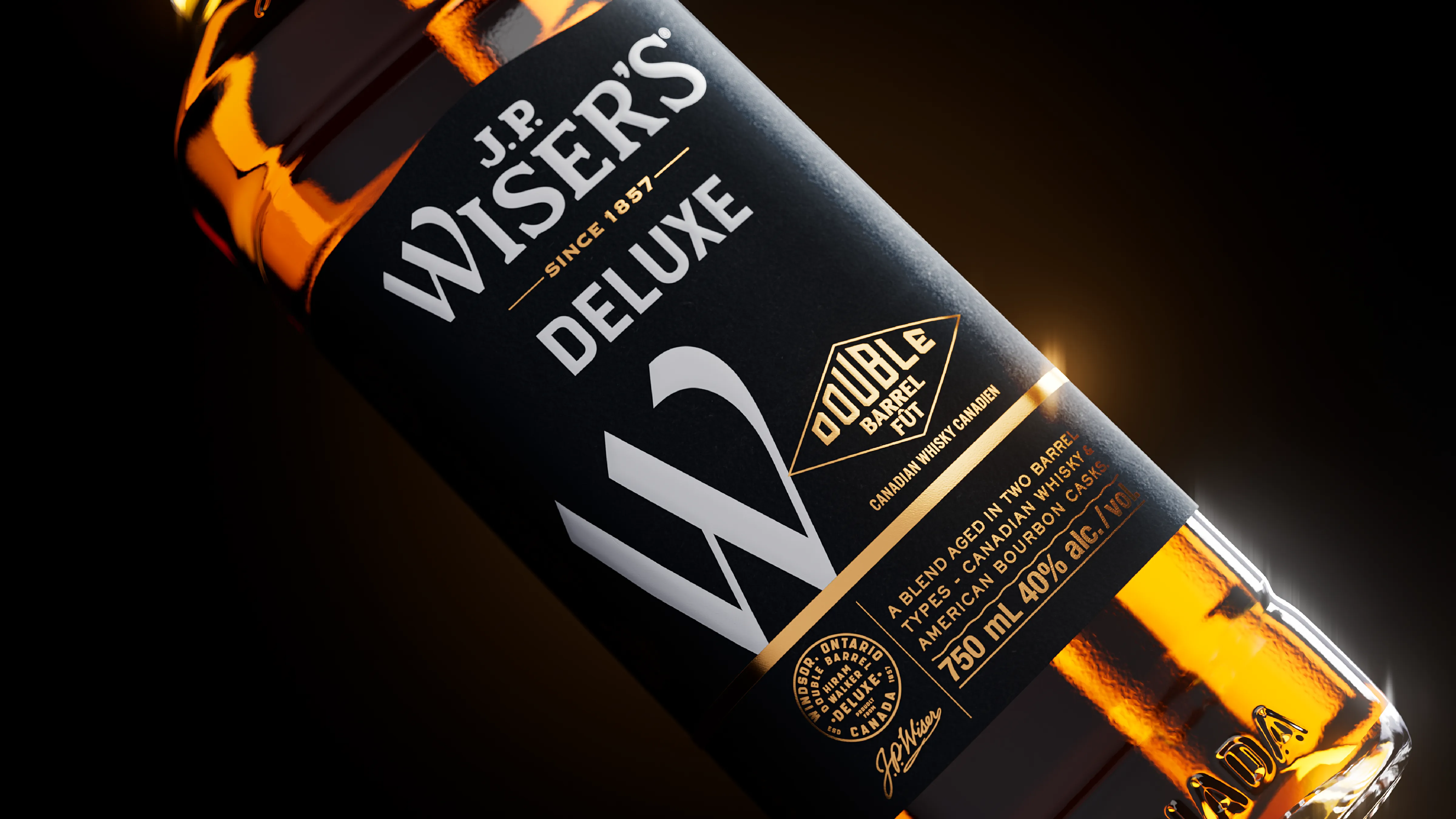
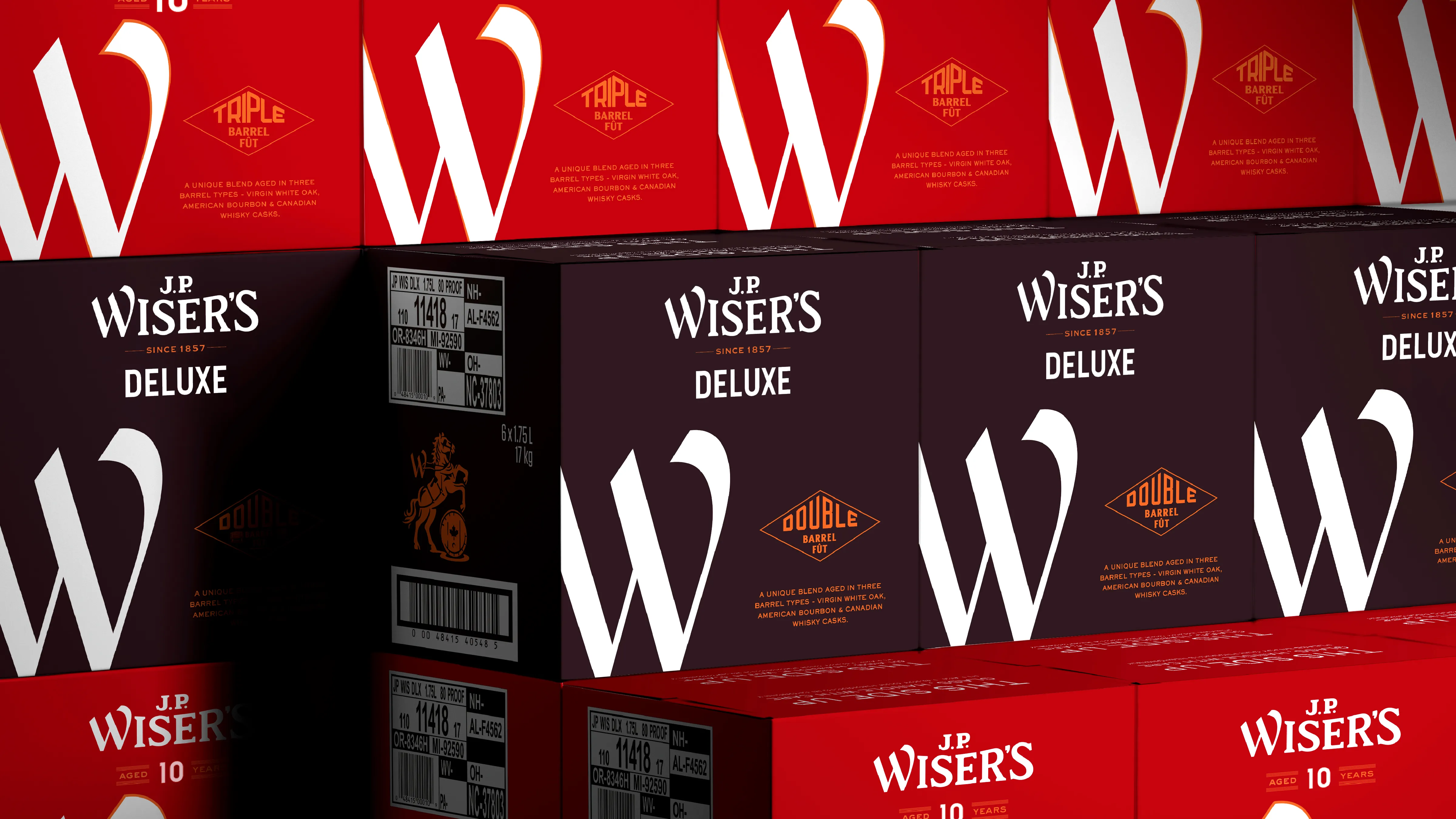
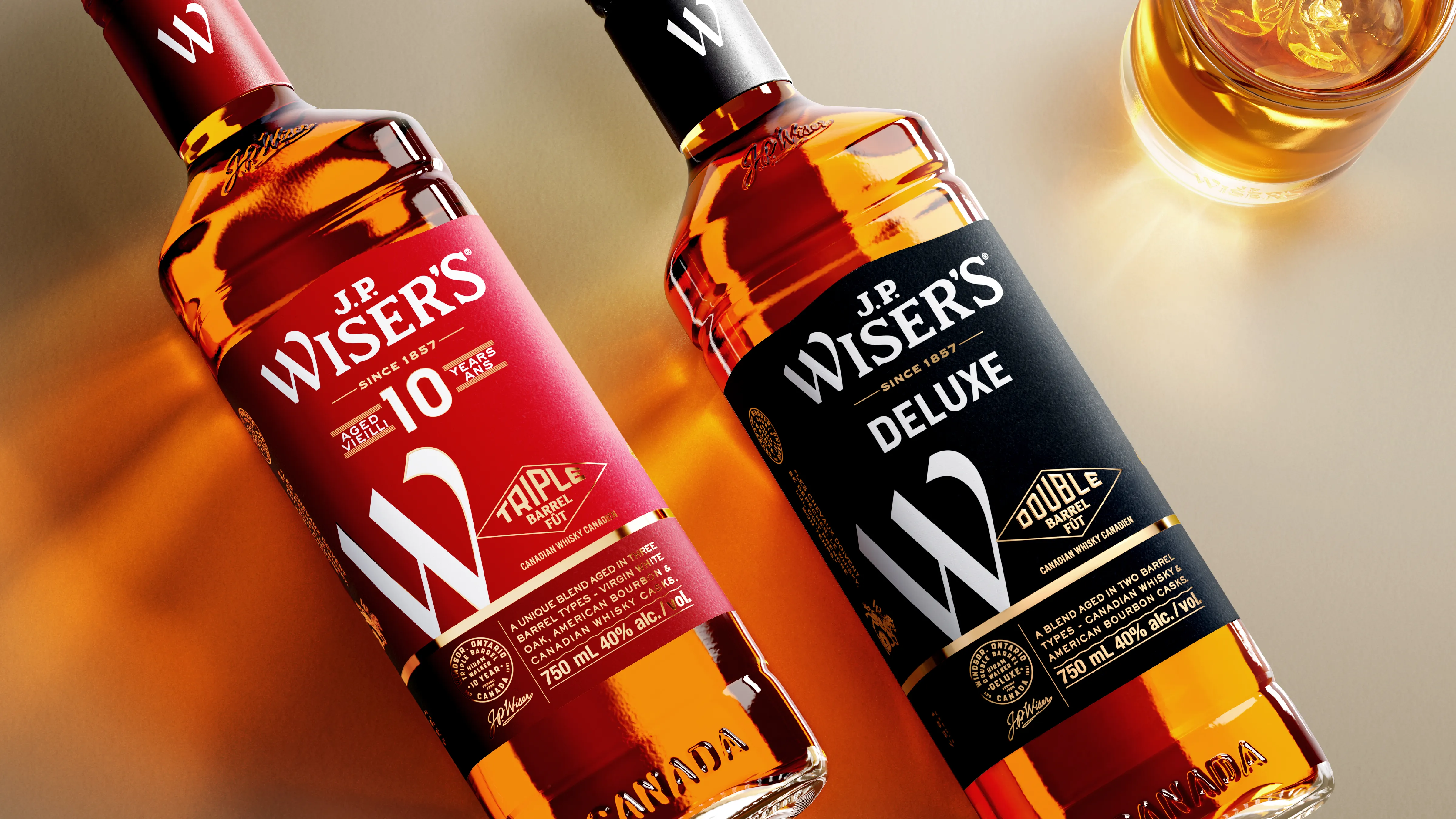
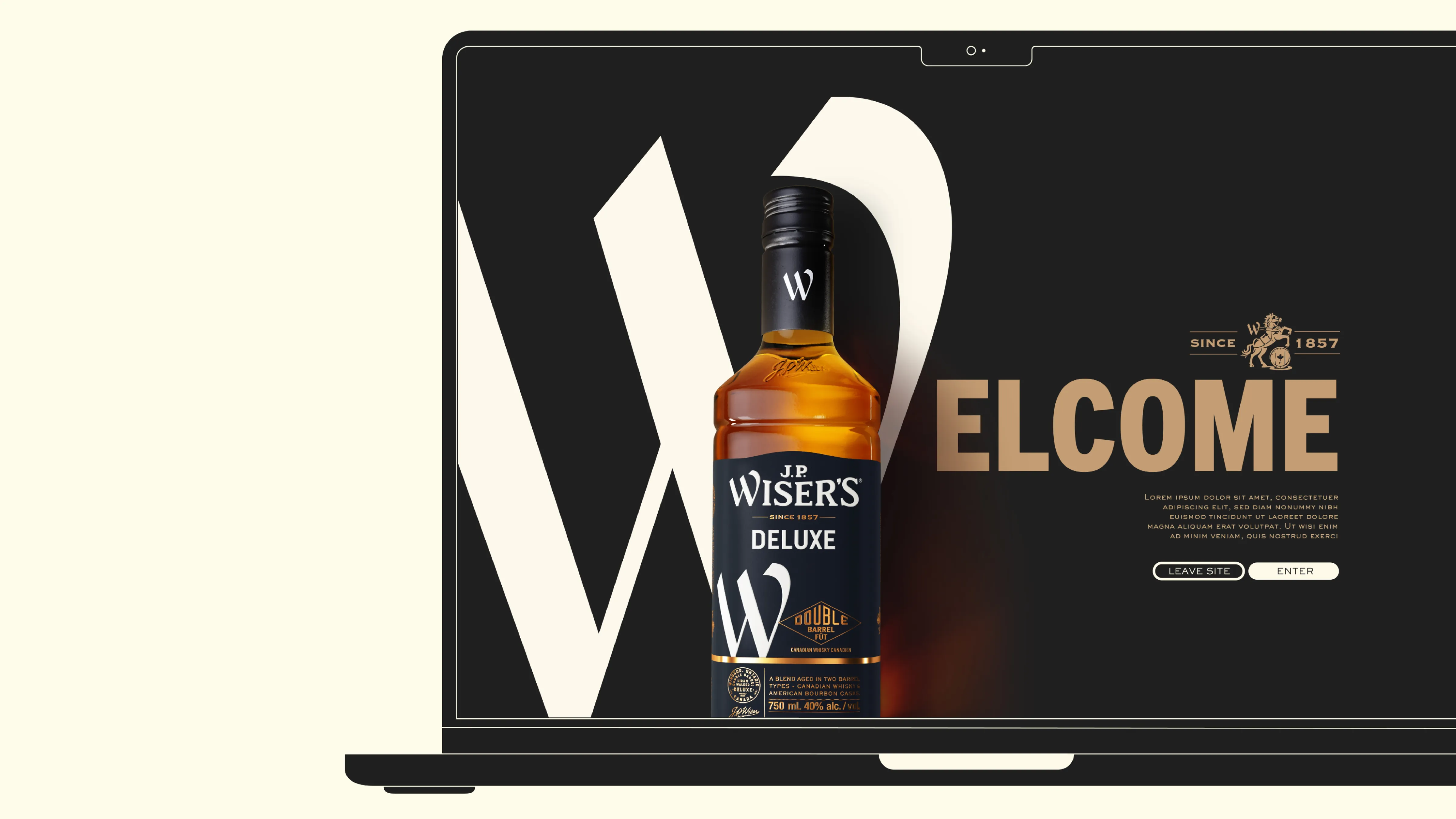
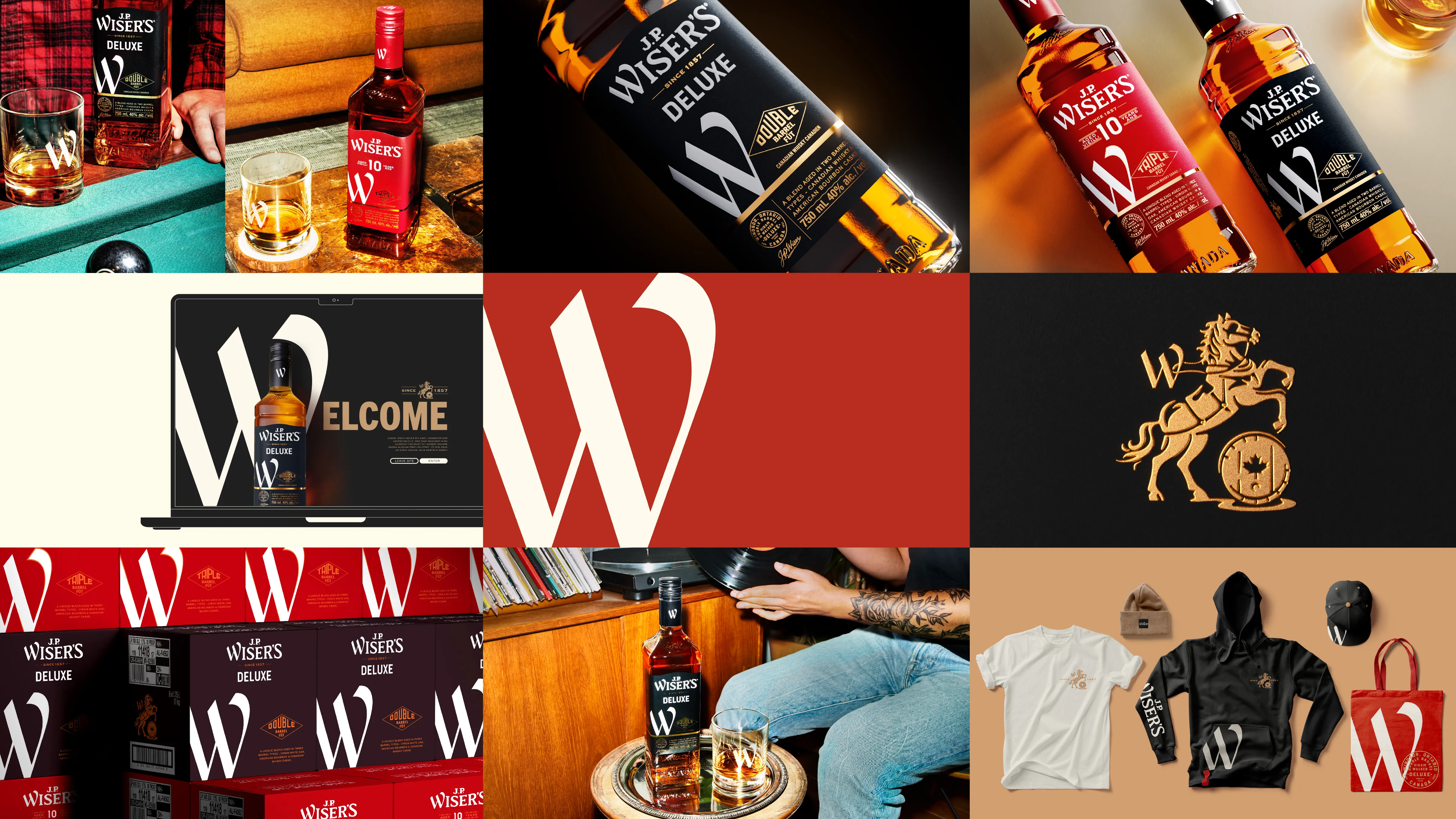
Looking back at the history of the Wiser's brand is a business that has constantly evolved over time. From humble roots, now the brand home of Canada's largest distillery. Thinking about the new identity, we let the story drive the creation of icons and symbols. A pivotal part of this transformation was elevating the ‘W’ from Wiser’s, turning it into a bold, defining symbol that extends beyond packaging, bringing clarity, consistency, and fresh vitality to the entire brand experience.


DESIGN PRINCIPLES
Bold:
Boldness is born of experience and has distilled over time into a feeling of true confidence. This is reflected in all the elements of the visual identity, from the prominent placement and execution of our brand signifier to the colour palette and typography styles.
Crafted:
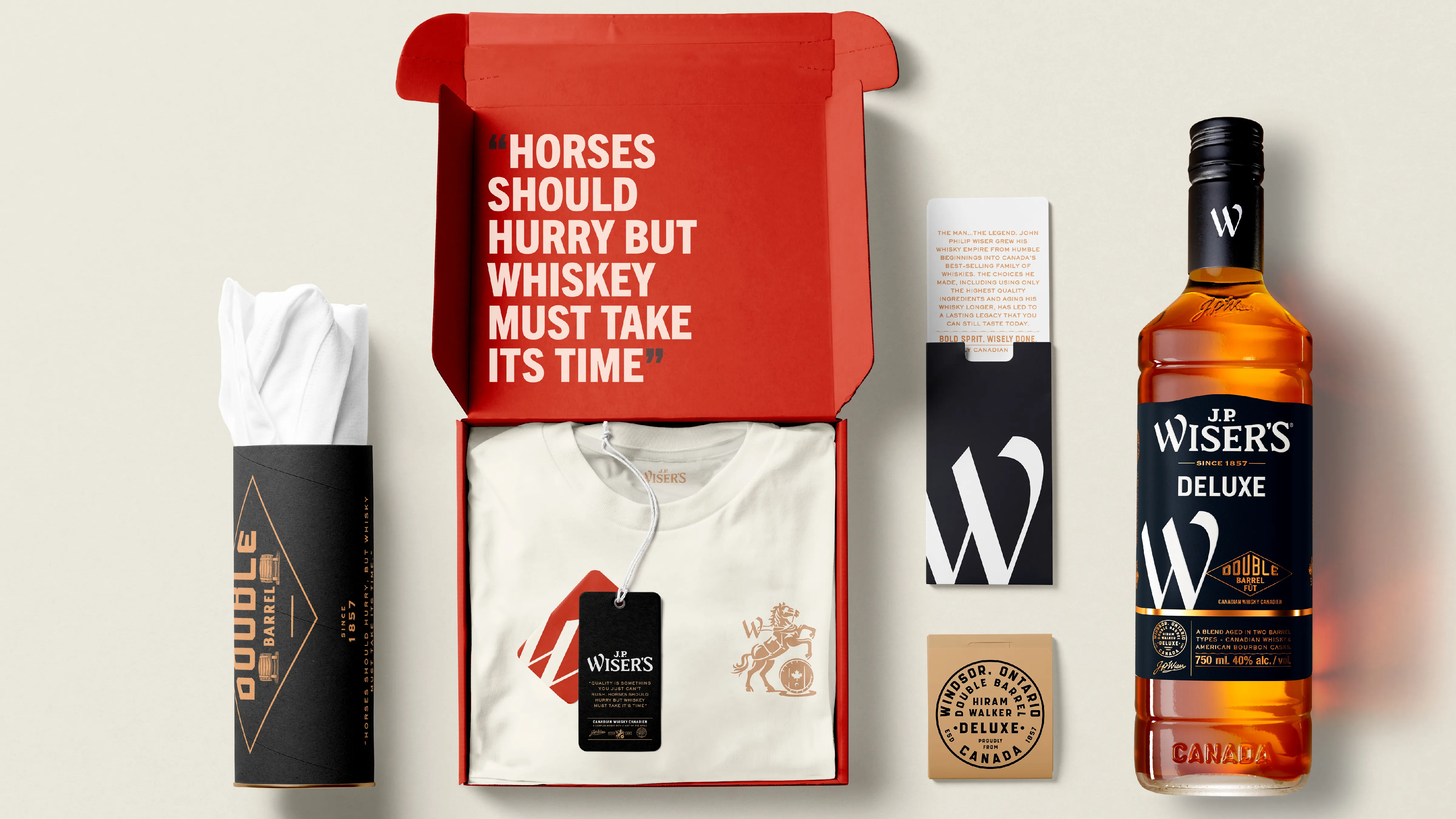
A bold spirit is beautifully balanced with crafted elements inspired by the whiskies industrial past. These elevate the brand with a touch of premiumness that honours J.P. Wiser’s heritage in a way that feels genuine, credible and true.

Iconic:
J.P. Wiser is a brand that is ready to come into its own and as such, they are single-minded in our execution. Maximizing impact at every touch point by heroing our brand signifier, cutting through the noise with the ‘Big W’, an asset that is destined to become a recognized and respected symbol of J.P. Wiser’s enduring legacy.
Brand World:
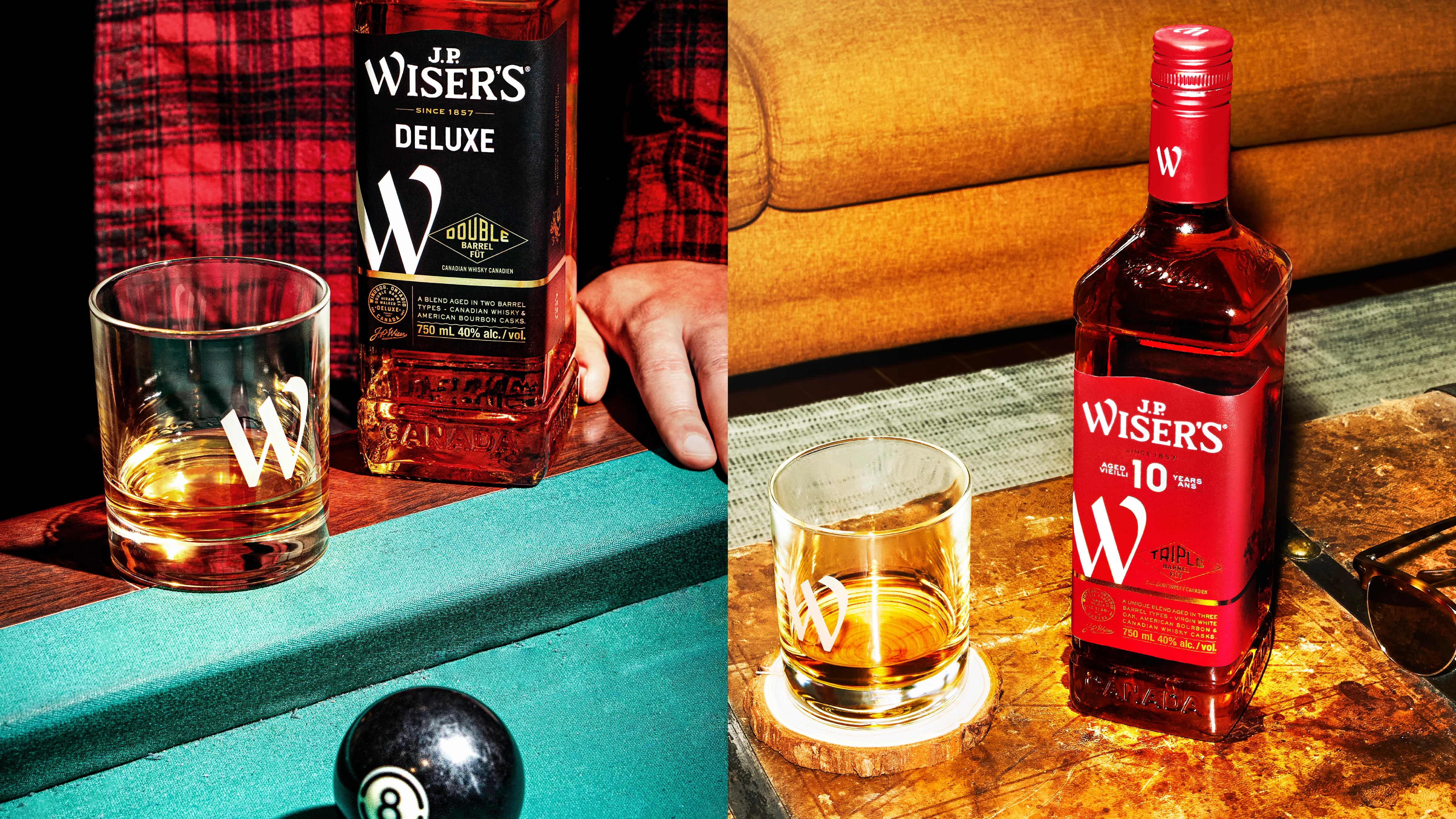
Using the newly designed brand elements, packaging and art direction, we can create a cohesive, but not cookie-cutter world that feels fresh, distinctive and bold. Wisely done.


Wisely Done:
With authenticity at its core and a bold modern design, J.P. Wiser’s has reasserted its place in the whisky world. The design commands attention—already winning SILVER at the Transform North America Awards and GOLD at the 2024 World Brand Design Society Awards.