Seriously Playful
Jameson
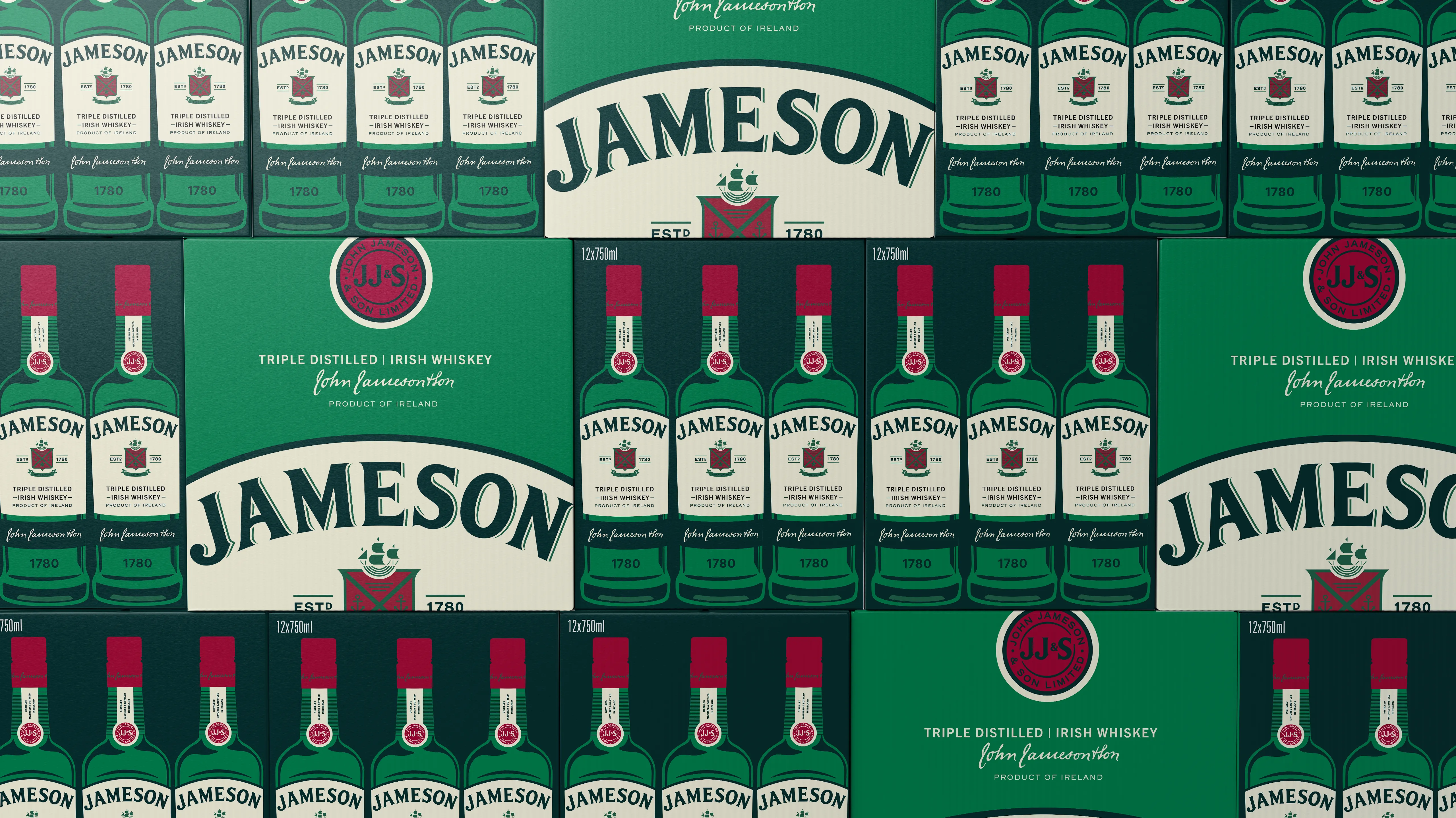
Future proof and modernise the brand, setting Jameson up for global success and to support an ambitionof becoming a top 5 global spirits brand by 2030 by being the worlds most shared spirit. Key objectives were to be more relevant, more distinctive, more magnetic, more premium and more cohesive. All while amplifying the idea "the serious whisky that does not take itself too seriously.
SHARPEN UP THE EDGES
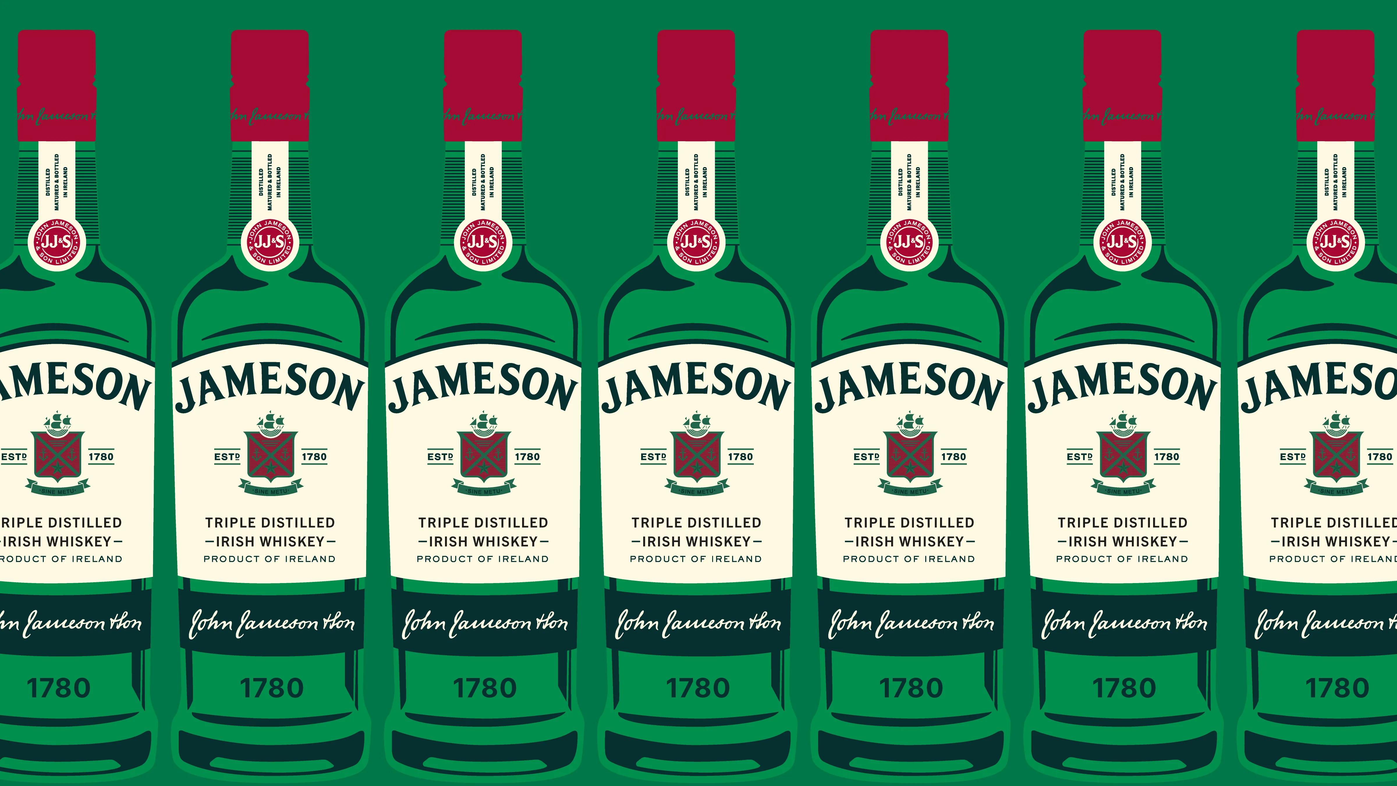
Starting with the smaller, magnetic details, making them feel more timeless, modern and iconic. Applying them to a new bottle shape to create a newer, prouder pack.

BRIGHTER, BOLDER MORE CONFIDENT
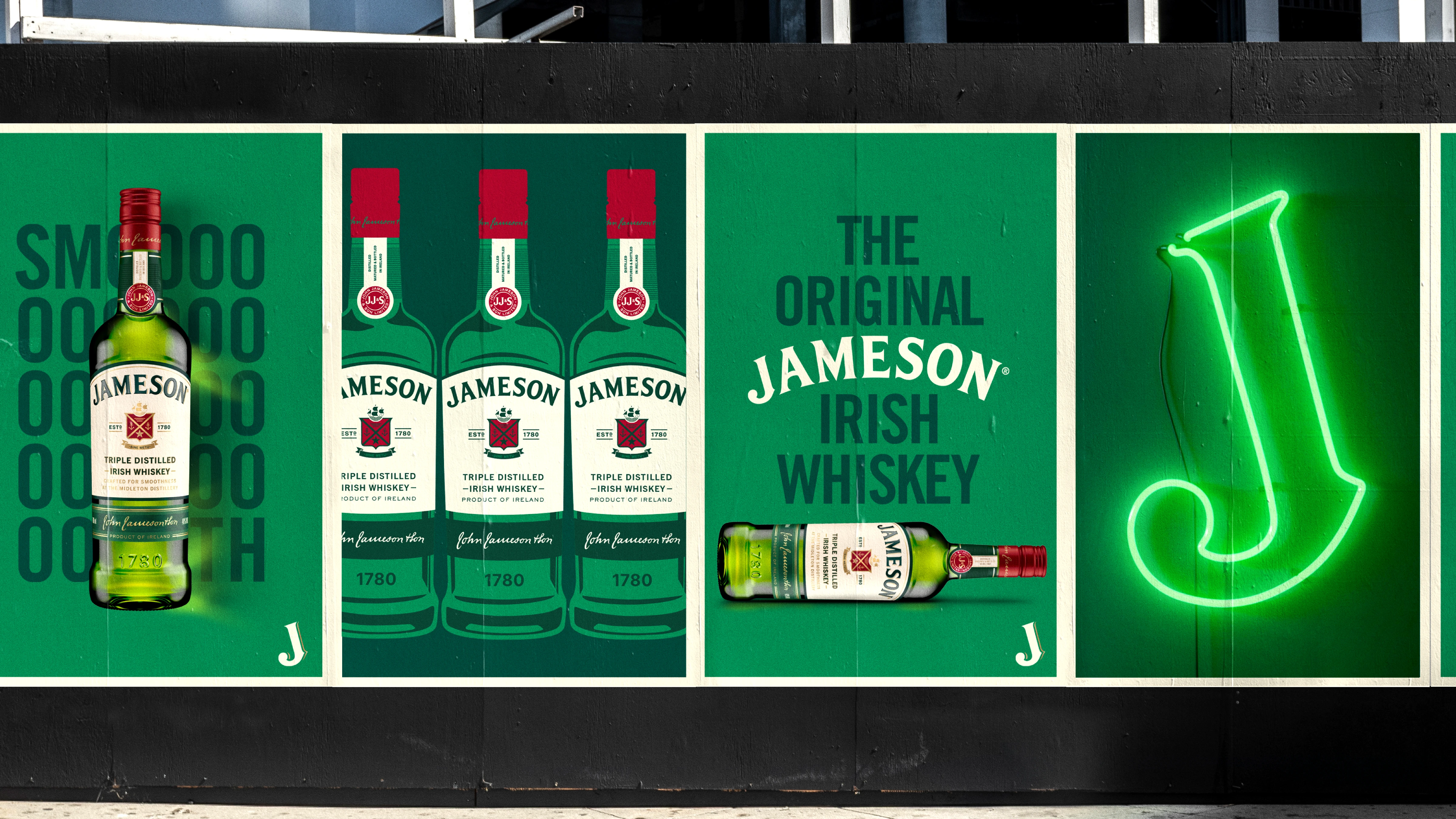
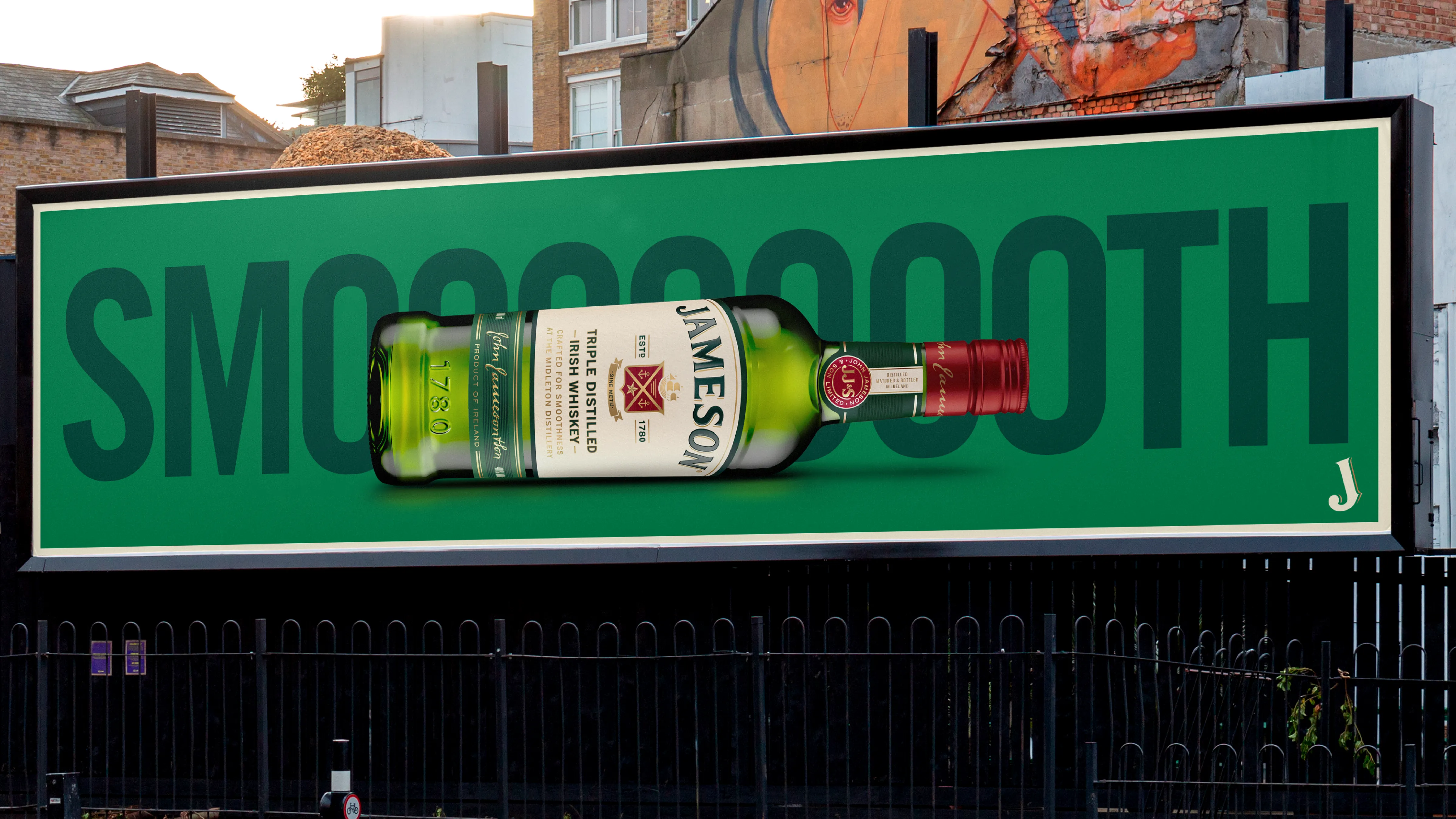
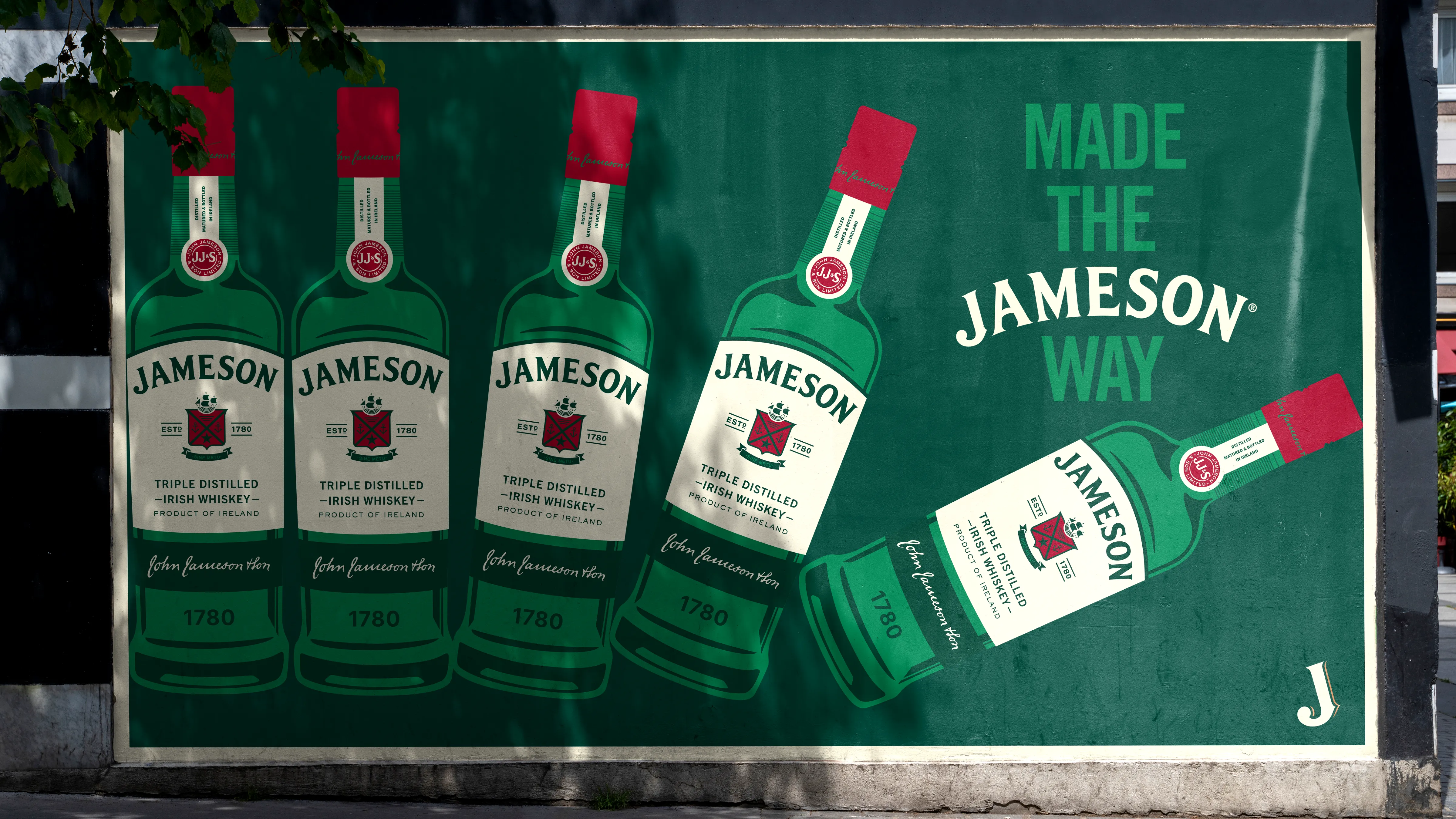
Looking at the rest of the off-pack brand elements such as icon and signifiers. Brightening up the color palette and introducing the neon elements to create a feeling of playfulness. The new layout system is cleaner, more modular, and built for flexibility across digital and physical formats. It’s designed to let the brand breathe—giving space for storytelling, while still feeling premium and intentional. Jameson has always had a wink in its eye, and we’re leaning into that with a tone that’s witty, self-aware, and unmistakably human.
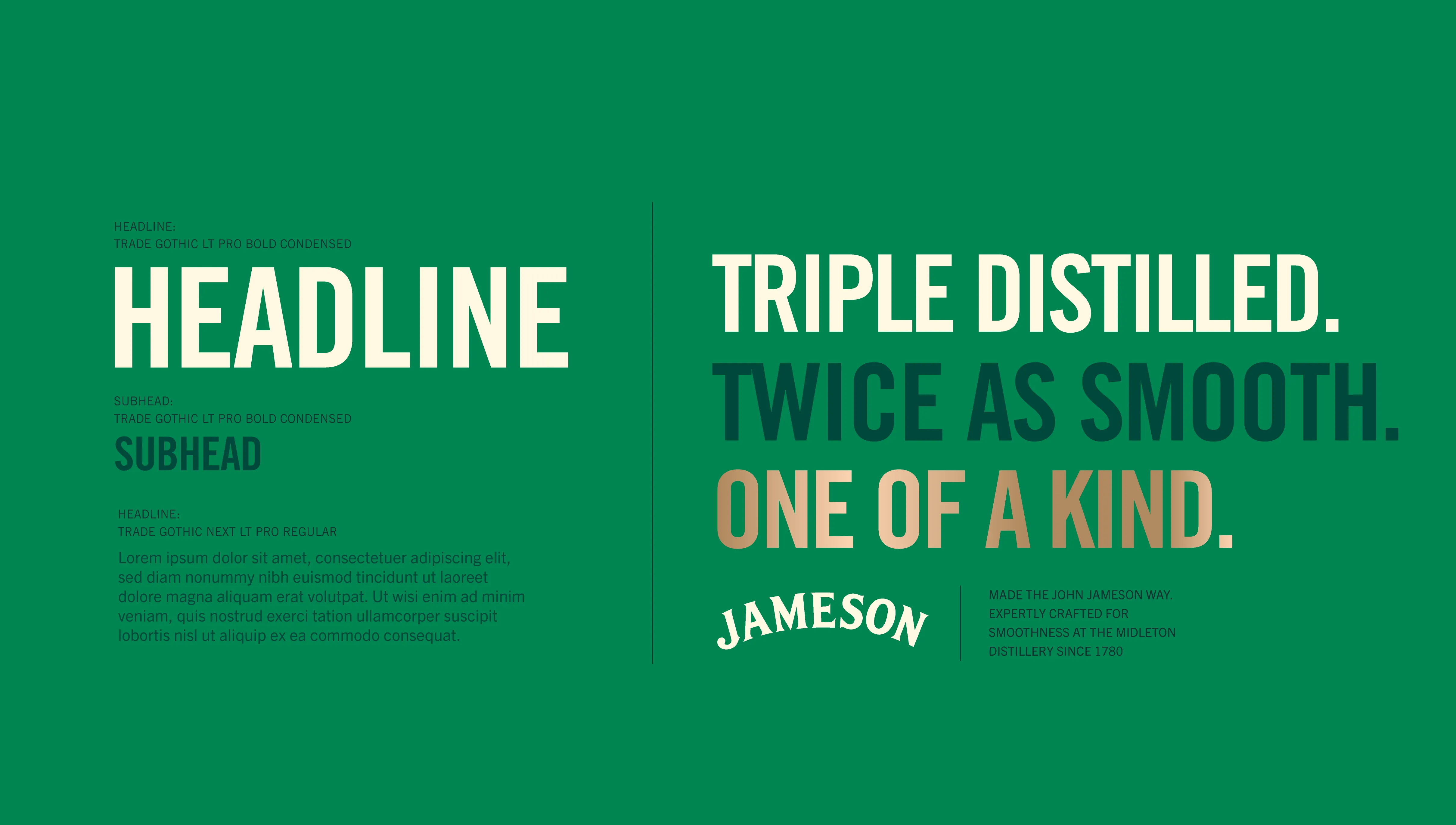
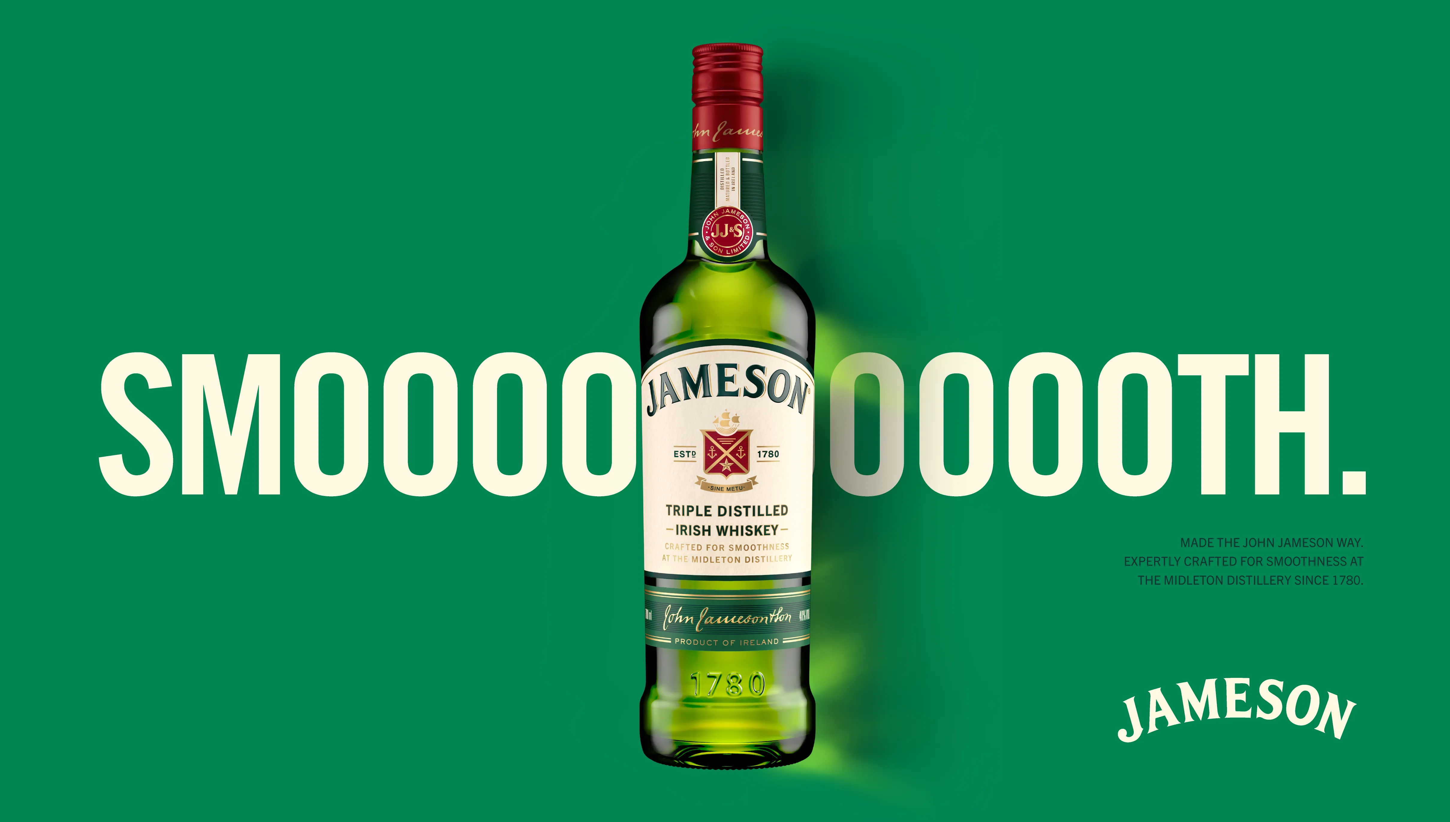
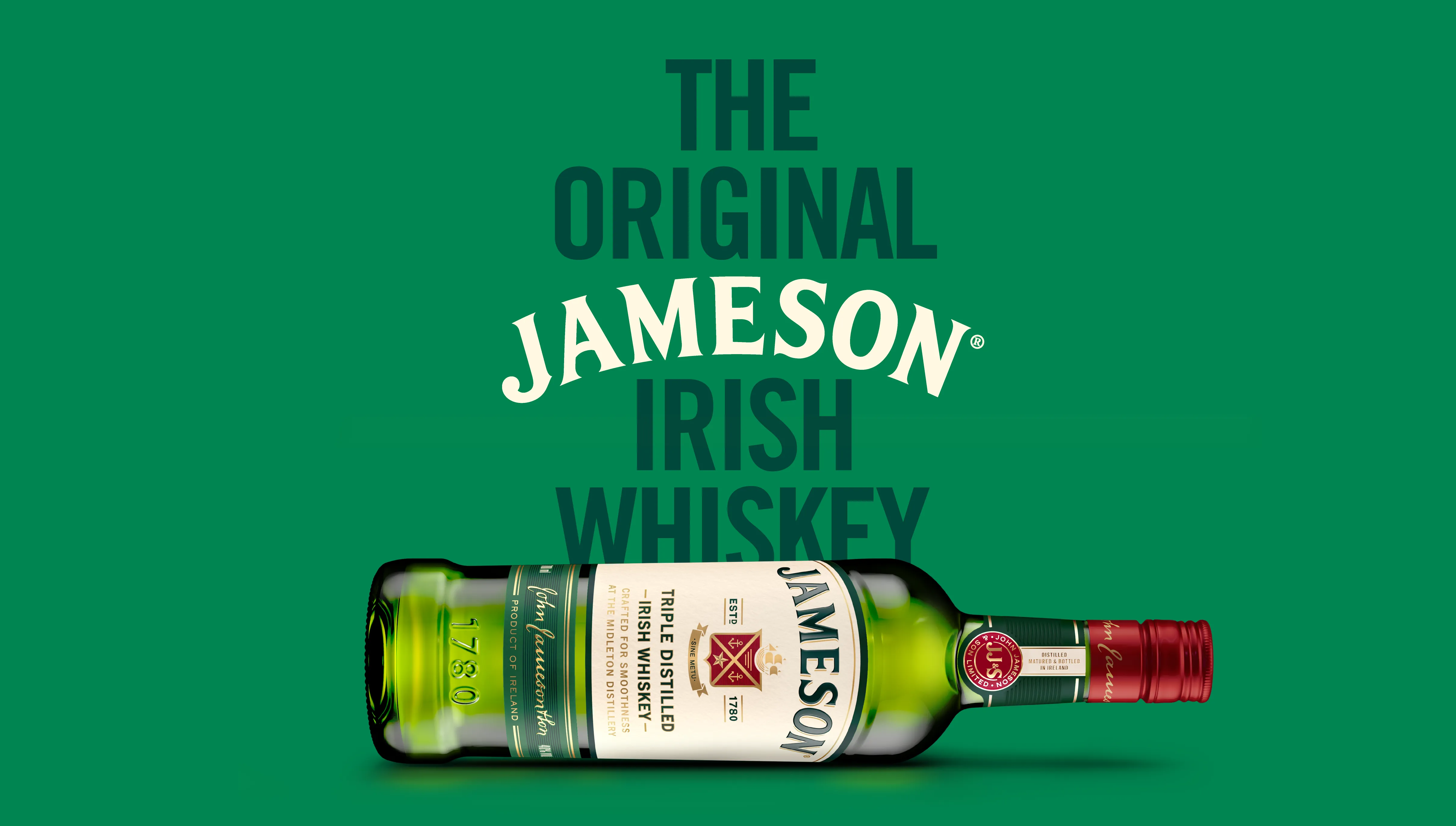
IDENTITY SUITE:
BRINGING IT TO LIFE:
